For almost 20 years now the Jumpman has been selling sneakers, shirts, hats, socks, wrist bands, back packs, and anything else Nike could attach a Jumpman to. Giving consumers a piece of Michael Jordan’s incomparable legacy.
But this didn’t happen overnight…
Let’s travel back to 1984 and re-trace the path of the now Infamous Jumpman logo…
The Jumpman logo is actually a silhouette of studio photograph of Mike performing a ballet move, not an actual dunk as the image suggests.
Here’s part of an interview with HOOP Magazine from April of 1997 where MJ talks about the creation of the Jumpman Logo.
“I wasn’t even dunking on that one.
People think that I was.
I just stood on the floor, jumped up and spread my legs and they took the picture.
I wasn’t even running.
Everyone thought I did that by running and taking off. Actually, it was a ballet move where I jumped up and spread my legs.
And I was holding the ball in my left hand.”
The original idea for the photo shoot of the Jumpman came from an older photo of Jordan in LIFE Magazine for the 1984 Olympics.
Nike “sampled” the idea for a poster featuring Mike suspended in air for what would later become the now famous Jumpman logo.
This photo was first featured on the hang tags of all the original Air Jordan I’s from 1985…
But the actual Jumpman logo didn’t join the mix for another 3 years.
Fast forward to 1988…
MJ’s contract with Nike was about to end and Rob Strasser, Nike’s VP was in a power struggle with Nike CEO Phil Knight. Rob and Peter Moore, Nike’s head designer, were secretly hatching a plan to lure the GOAT away from Nike to their new sneaker company called Van Grack. Peter Moore originally did the preliminary design work on the Air Jordan III. He had a pile of sketches of the Air Jordan III but waited until it was too late to execute.
When he left Nike, Tinker Hatfield got the sketches and in amongst it were the outline of the Air Jordan Jumpman logo.
Since 1985, Nike sales have jumped through the roof and Phil Knight (Nike’s CEO) was not about to lose Mike that easily.
He gave Tinker the task of creating & presenting the next AJ III. Both Tinker and Ron Dumas designed the entire AJ III line in a matter of weeks.
Once MJ saw that luxurious tumbled leather wrapped in elephant print with that big, beautiful, fire red Jumpman logo on the tounge, that was it. The Air Jordan III is arguably the most celebrated shoe in the history of the line and was the first to feature the iconic Jumpman.
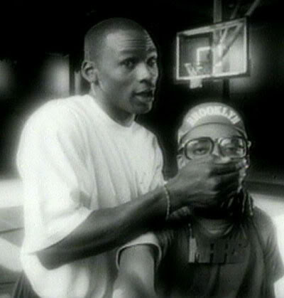
Nike then attached Spike Lee to the ad campaign playing his endearing character Mars Blackmon and the rest is history.
By the end of Michael Jordan’s career with the Bulls, the Jumpman was strong enough live outside of the shadow of big brother Nike and Brand Jordan soared to new heights.
From a quick Life Time Magazine photoshoot to a CEO of a multi-million dollar company.


I’m interested in the design, what’s it take to create my own jumpman logo and submit it?
i love jordans my closet is full uf them
Reblogged this on nba2kproductions and commented:
Jumpman, the Origins.
Does anyone out there know the correct size of the first Nike air Jordan jumpman poster the one that has the city of Chicago in the background I am looking to by one I don’t know if it is a reprint or not thanks
I wish just my clothing label be like Jordan’s.,.if i could get sponsors like Nike, is i think it will be on the right side so i can open it’s gallery store.,. taso vs pedestrian clothing label.,.,
DAMNIT…! Extremely through, highly informative…couldn’t have asked for anything more. As a sneaker head of old, I missed out on the XI’s back in ’96 and have beat myself up about them every since. Last month I was lucky enough to get my hands on a pair of the new release BRED’s and thought my mission was complete…then as I began to examine the shoe and compare them to previous releases I noticed that the Jumpman on these were facing the same way. The original release (to my knowledge had both Jumpman symbols facing the front of the shoe, (ball towards the front), the pair I just got has the left shoe’s Jumpman facing the back of the shoe, and the right shoe has the Jumpman facing the front…I was initially alarmed and for days have felt as though I have paid full price for some official fakes!!! Up to this point I never questioned the Jump man logo…never really paid attention to what hand the ball was in, I just always assumed it was his right hand. This puts my thoughts to rest, and although I still believe the quality is sub-par, and the logo placement is not true to the original form, I do have to concede that we are talking about shoes with a design & technology that is over 15 years old…so I believe I can wear them (eventually), with confidence. Again, thank you for this…I don’t know how you got that gif, but that is indeed DOPE. Much appreciated!
Yeah they changed the direction of the Jumpman on the re released XI’s so they’re both facing the same direction. I’m a Graphic Designer and a Jordan collector so this is something that I’m passionate about on multiple levels. Thanks for your comment.
I was training basketball here in Bulgaria at the 90`s. NBA and Mike Jordan was a religion also Space Jam was my favorite movie. Every one wanted to have the new NIKE AJ shoes and when I bought mine I felt like a pro 🙂